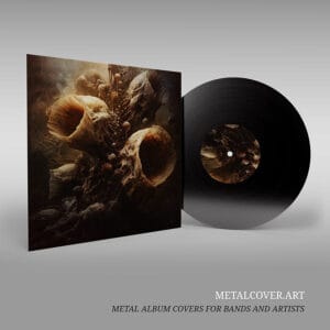
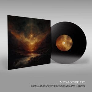
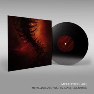
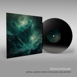
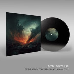
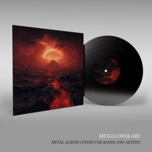
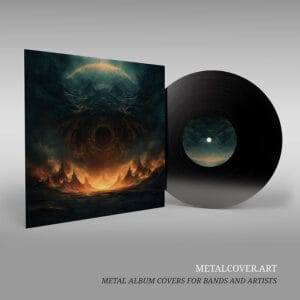
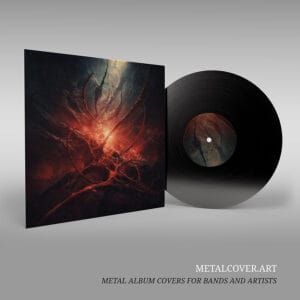
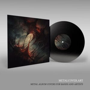
You have found the perfect album cover for your next release. The artwork captures your band's aesthetic, the composition is striking, and the color palette perfectly complements your music. Now comes a critical question: how do you prepare album art for print at 300 DPI to ensure that this digital image translates perfectly to a physical product—whether that is a CD jacket, vinyl sleeve, or merchandise?
Learning how to prepare album art for print at 300 DPI is essential for any band planning a physical release. Many independent bands encounter unexpected surprises when they receive their first printed copies because they did not properly prepare album art for print at 300 DPI. Colors appear different than expected, text gets cut off during the printing process, or the image quality seems diminished compared to the digital version. These issues are not failures of the artwork itself but rather the result of misunderstanding the technical requirements of how to prepare album art.
This comprehensive guide walks you through the essential steps to prepare album art for print, ensuring that your final product matches your vision.
Understanding DPI and Resolution
The foundation of print-ready artwork is resolution, measured in dots per inch (DPI). This metric determines how much detail and clarity your image will have when printed at a specific size. Understanding DPI is the first step in learning how to prepare album art for print.
What is DPI?
DPI measures the number of individual dots of color that a printer places per inch of paper. Higher DPI values result in sharper, more detailed images. Lower DPI values result in pixelated, blurry output. When you prepare album art for print at 300 DPI, you are ensuring maximum quality.

Why 300 DPI?
The industry standard for professional printing is 300 DPI. At this resolution, the human eye cannot distinguish individual dots, resulting in a smooth, continuous image. This standard applies to all professional print applications, from CD jackets to vinyl sleeves to merchandise. When you prepare album art for print at 300 DPI and print it at its intended size, the result is crisp, detailed, and professional.
What about screen resolution?
Digital displays like computer monitors and smartphones use 72 DPI or 96 DPI. This lower resolution is acceptable for screen viewing because the pixels on a display are larger than the dots on a printed page. However, if you attempt to print an image created at 72 DPI at a large size, the result will be noticeably pixelated and blurry.
Practical implications:
When you prepare album art for print at 300 DPI from a professional source like metalcover.art, you ensure that your artwork will print at professional quality regardless of the final size. If you are working with a designer or artist, always request that final files be delivered at 300 DPI when you prepare album art for print.
Color Profiles: RGB vs. CMYK
One of the most common surprises for bands learning how to prepare album art for print at 300 DPI is that the colors in the printed version look different from the colors on their computer screen. This discrepancy is not an error—it is the result of different color models used for digital display versus print production. Understanding this is crucial.
RGB Color Space:
RGB (red, green, blue) is the color model used by all digital displays, including computer monitors, smartphones, and tablets. RGB works by combining different intensities of red, green, and blue light to create all visible colors. Because RGB uses light, it can display a wider range of colors than print, including bright, vibrant hues that are impossible to reproduce in print.
CMYK Color Space:
CMYK (cyan, magenta, yellow, and black) is the color model used in professional printing. Unlike RGB, which uses light, CMYK uses pigments and inks to create color. The range of colors that can be reproduced in CMYK is narrower than RGB, particularly for bright, saturated colors. This is a fundamental limitation of the printing process, not a failure of the printer or the artwork.
The Conversion Process:
When artwork created in RGB is converted to CMYK for printing, some colors will shift. Bright blues may become slightly darker, vibrant reds may become more muted, and neon colors may lose their intensity. This is a normal and expected part of the print production process when you prepare album art for print at 300 DPI.
Best Practices:
To minimize unwanted color shifts when you prepare album art for print at 300 DPI, professional designers create artwork in CMYK from the beginning, designing with the limitations of print in mind. If you are working with artwork that was created in RGB, request that your printer or designer create a CMYK preview before finalizing the print job. This allows you to see how the colors will appear in print and make adjustments if necessary.
Bleed and Safety Zones
When a printer produces a CD jacket or vinyl sleeve, the artwork must be trimmed to the final size. This trimming process is not perfectly precise—there is always a small margin of error. To account for this, professional artwork includes “bleed” and “safety zones.”
What is bleed?
Bleed refers to the area of artwork that extends beyond the final trim line. If you want color or imagery to extend all the way to the edge of the final product, it must extend into the bleed area. Typically, bleed is 0.125 inches (or 3 millimeters) beyond the final trim line. Without bleed, you risk having a thin white or unprinted edge around the perimeter of your final product.

What is the safety zone?
The safety zone is the area inside the trim line where critical elements like text, logos, and important imagery should be placed. The safety zone is typically 0.25 inches (or 6 millimeters) inside the final trim line. Any text or logo placed outside the safety zone risks being partially cut off during the trimming process.
Practical implications:
When preparing artwork for print, ensure that all text, band logos, and critical imagery are positioned within the safety zone. Background imagery and decorative elements can extend into the bleed area. If you are unsure about the exact specifications for your particular print format (CD jacket, vinyl sleeve, etc.), request detailed specifications from your printer or designer.
For MetalCover.art customers:
All artwork provided by metalcover.art is created with professional print specifications in mind, including appropriate bleed and safety zones. When you receive your files, they are ready for professional printing without additional modifications.
Preparing Your Artwork for Different Print Formats
Different physical formats have different technical requirements. Understanding these requirements ensures that your artwork looks professional across all formats.
CD Jackets:
Standard CD jackets are 4.75 inches by 4.75 inches (120 millimeters by 120 millimeters). The artwork should be created at this size with appropriate bleed and safety zones. Text should be legible at this relatively small size, and fine details should be clear and crisp.
Vinyl Sleeves:
Standard 12-inch vinyl sleeves are 12.375 inches by 12.375 inches (approximately 314 millimeters by 314 millimeters). This larger format allows for more detailed artwork and smaller text. However, it also means that any imperfections or low-resolution elements will be more apparent at this larger size.
Merchandise (T-shirts, hoodies, etc.):
When printing artwork on merchandise, the specifications vary depending on the item and the printing method. Screen printing, direct-to-garment printing, and heat transfer printing all have different resolution and color requirements. Consult with your merchandise printer for specific specifications.
File Formats and Delivery
Once your artwork is prepared, it must be saved in the correct file format for printing. Different printers may have different preferences, but the most common formats for professional printing are:
PDF:
Portable Document Format (PDF) is widely used for print production because it preserves all design elements, fonts, and colors exactly as intended. PDFs are reliable and compatible with virtually all professional printing workflows.
TIFF:
Tagged Image File Format (TIFF) is a high-quality image format commonly used for professional printing. TIFF files are larger than JPEGs but preserve all image data without compression.
PSD (for designers):
If you are working with a designer, they may deliver files in Photoshop format (PSD) for your records. However, for actual printing, request that files be exported to PDF or TIFF format.
Avoid JPEGs for print:
While JPEGs are suitable for web use and email, they use lossy compression that can result in visible artifacts and quality loss when printed at large sizes. Always use PDF or TIFF for professional printing.
Common Mistakes to Avoid
Understanding common mistakes can help you avoid costly errors in your print production process.
Mistake 1:
Using low-resolution artwork.** Attempting to print artwork created at 72 DPI will result in pixelated, blurry output. Always ensure that artwork is at 300 DPI before sending to print.
Mistake 2:
Not accounting for color shift.** RGB colors often appear different in CMYK print. Request a color proof before committing to a full print run to verify that colors appear as expected.
Mistake 3:
Placing critical elements outside the safety zone.** Text and logos placed too close to the edge risk being cut off during trimming. Always maintain appropriate safety zones around critical elements.
Mistake 4:
Using the wrong file format.** Sending a JPEG or low-resolution image file to a professional printer often results in poor quality output. Always use PDF or TIFF for professional printing.
Mistake 5:
Not communicating specifications clearly.** Different print formats and printing methods have different technical requirements. Always confirm specifications with your printer before finalizing artwork.
Conclusion:
Successfully Prepare Album Art for Print at 300 DPI
The transition from digital artwork to physical product involves several technical considerations, but understanding these requirements ensures that your final product matches your vision. By working with high-resolution artwork, understanding color profiles, accounting for bleed and safety zones, and using the correct file formats, you can confidently move your album artwork from screen to print.
Professional artwork created by experienced designers—like those at MetalCover.art—is created with these technical requirements in mind from the beginning. When you select premade artwork from a professional source, you can be confident that the files are print-ready and will produce professional results across all formats.
Ready to take your album artwork from digital vision to physical reality? Browse our print-ready collection of Metal Album Covers and find the perfect artwork for your next release. All artwork is provided at 300 DPI and is ready for professional printing.